ADD-IN
Exciting product updates this Summer
Discover the exciting summer product updates from Wrepit! Experience the power of the game-changing Excel2Word Microsoft Add-in, plus more!
Learn the essential tips and best practices for creating accurate and effective financial reports.

Content and its quality play a huge role in creating beautiful and effective financial reports. With a focus on the aesthetics of a report, the team and I have sat together to come up with top tips to help our Authors and the financial report industry.
Wrepit transforms everyday Word documents into beautiful online reports.
These are universal fundamental tips on creating engaging financial reports, whether you are using our Wrepit or not.
Know your audience. Generally, those reading financial reports are very busy individuals. They are skimming through your report for topics of their particular interests. Shorter headlines are easier to read/scan and aesthetically look more impactful.
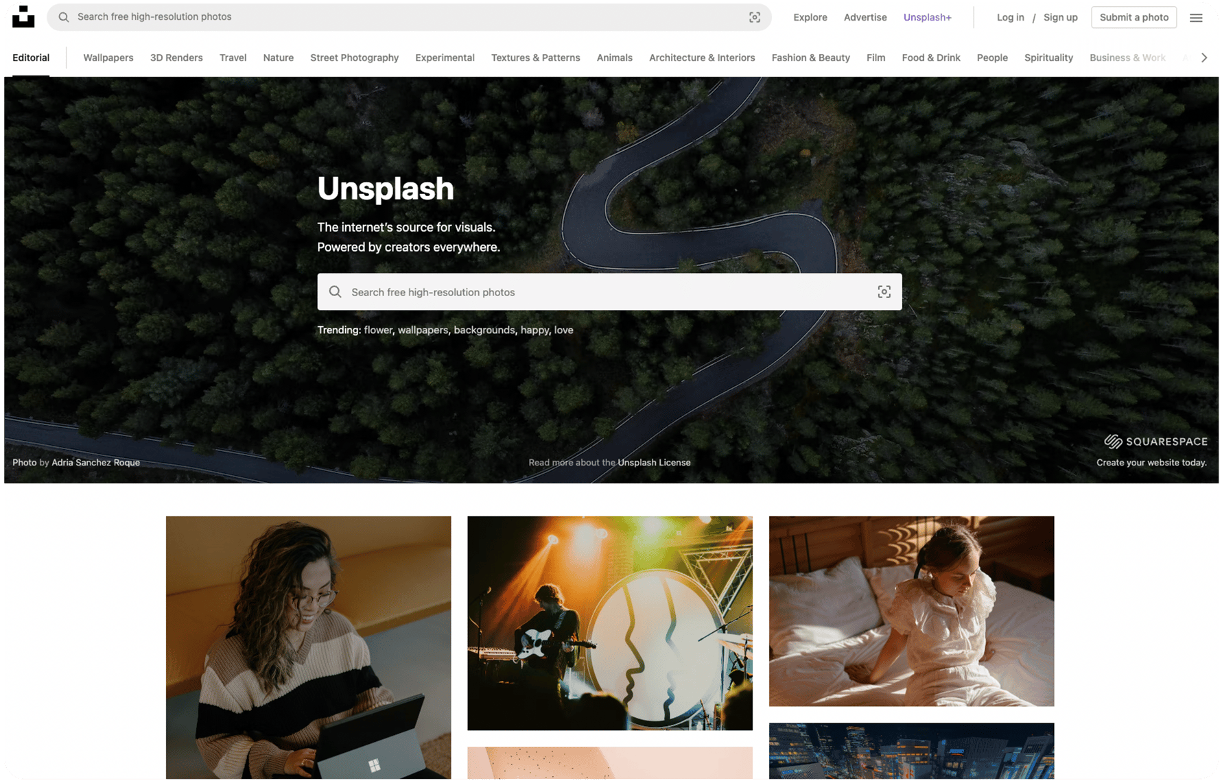
Images are helpful to keep your readers engaged by breaking up continuous copy but also help tell a story or set a context, whether it's choosing imagery for your cover or creating a good pause. When finding imagery, it's essential to note tone, lighting, contrast, and composition. Quality, free imagery sites are pexels.com and unsplash.com. Just remember to credit the photographer.
Your company's brand guidelines should inform fonts. What makes interesting reports is when a display font (generally a fancier font with more character) is used in titles and even H1 headings, and a simpler, more readable sans serif font is used in body copy and paragraphs. A free font source is https://fonts.google.com/, and a converter from True type to woff2 is https://cloudconvert.com/ttf-to-woff2.
Colors should come from your company's brand guidelines. Be sure to primarily use your brand's primary color (e.g., in your H1 headings, charts, quotes on color, and main design) and add them to the Wrepit Portal.
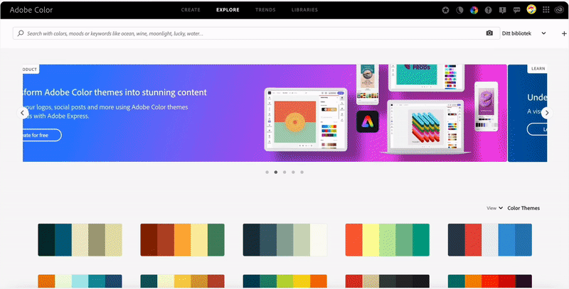
Should you be able to be more creative, https://color.adobe.com/explore is a handy tool where you can explore colors, trends, moods, and keywords.
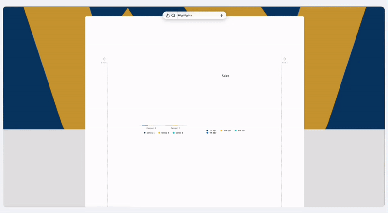
Data visualization includes charts of all sorts.
Use MS Word's built-in charts and graphs feature to give insightful data representations and add engagement. It helps readers see, interact with, and better understand data. Simple or intricate, regardless of the readers' expertise, visualization can bring everyone on the same page.
These tips inform us of the why and how to use our various design elements that only apply through Wrepit. Using these elements could help take your report to the next level.
Well-designed financial reports keep readers engaged. Highlighting key figures and quotes in combination with imagery, fonts, and color selection in a consistent theme will make the reports look more professional. This was a driving reason why we created design elements that instantly elevate your report without much effort.
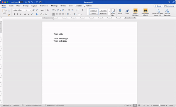
For Wrepit to read your document correctly, always use MS Words style settings for your title, all headings, body copy, and notes.
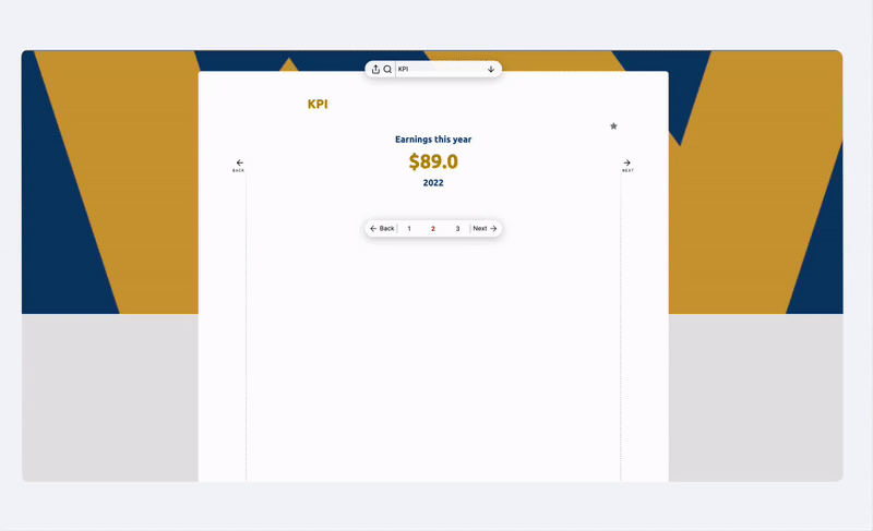
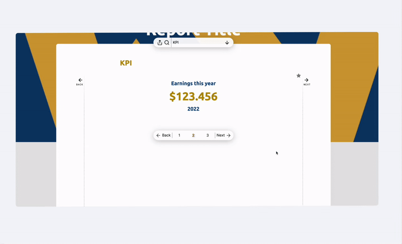
Financial reports will, in most cases, contain key performance indicators consisting of charts, quotes, and images. This gives the reader a quick and easy overview of the report and a taste of the most important statistics that will follow in the report. Start by adding a table with two columns and a maximum of six rows into Word, insert your elements, and Wrepit will give you a seamless representation of your most important statistics.
You can further emphasize the importance of your numbers by adding an animated KPI between your paragraphs. A great way to add some movement and engagement to a report. There is a character limit of ten characters, and you must use either a full-stop punctuation mark or a comma to separate digits. (e.g., 1,000,000 as opposed to 1 000 000).
The quote design element will highlight information of your choice. Quotes should generally consist of essential statements from, e.g., the CEO or a short and impactful sentence pulled from the report's content. Keep in mind that shorter quotes are easier to read and look aesthetically better, similar to headings.

Utilizing a combination of KPIs and quotes throughout your report will make content stand out and break up content, giving readers room to take in what they have read and stimulate creativity and add symbolic meaning to what is being read.
When adding tables, style your sum rows differently from your other rows and keep tables as separate Excel docs. For footnotes, you can use superscript in Excel to denote them and place them at the bottom of the table. Note that Wrepit does not allow vertically merged columns.
Give credit where credit is due. When citing from different sources, use the built-in citations feature in Word. Wrepit will read and include your citations at the bottom of the page.
Using the cross-reference feature in MS Word on the various tables and charts, readers can favorite and compare in the Wrepit viewer.
Discover the exciting summer product updates from Wrepit! Experience the power of the game-changing Excel2Word Microsoft Add-in, plus more!
Transform your reports with our User-Friendly design templates.
ESEF and CSRD regulations add bureaucracy to financial reporting. Could it still be a blessing in disguise for the efficiency of the CFO team?